Адрес
304 North Cardinal St.
Дорчестер Центр, Массачусетс 02124
Рабочие часы
Понедельник - пятница: 7AM - 7PM
Выходные: 10AM - 5PM
Адрес
304 North Cardinal St.
Дорчестер Центр, Массачусетс 02124
Рабочие часы
Понедельник - пятница: 7AM - 7PM
Выходные: 10AM - 5PM

Теория цвета в дизайне интерьера формирует атмосферу каждой комнаты.
Цвет влияет на настроение, помогая интерьеру чувствовать себя спокойно, энергично или роскошно.
Он влияет на восприятие, заставляя пространство казаться больше, теплее или более привлекательным.
Цвет создает единство, обеспечивая гармоничное сочетание элементов дизайна.
Он подсказывает, как соединить комнаты, уравновешивая контраст и непрерывность.
Понимание теории цвета имеет решающее значение для создания стильных, неподвластных времени интерьеров.
Теория цвета в дизайне интерьера - это основа того, как ощущается и функционирует пространство.
Она помогает дизайнерам выбрать палитру, которая улучшает настроение, подчеркивает детали и создает гармонию.
Благодаря пониманию этих принципов каждый интерьер будет выглядеть продуманным и целостным.
В дизайне интерьера теория цвета играет центральную роль в формировании эмоций.
Мягкие и приглушенные тона создают спокойствие и расслабление, поэтому они идеально подходят для спален и ванных комнат в стиле спа.
Яркие и живые оттенки, такие как желтый или оранжевый, заряжают энергией, идеально подходят для кухонь или творческих студий.
Темные и драматические оттенки добавляют ощущение изысканности, превращая гостиную или офис в место для смелых заявлений.
Дизайнеры используют цвет, чтобы рассказать историю внутри помещения.
Например, голубой цвет часто символизирует спокойствие, а зеленый - баланс и естественность.
Нейтральные цвета отличаются универсальностью, выступая в качестве холста для более выразительных акцентов.
При правильном применении теории цвета помещение не только выглядит красиво, но и соответствует своему назначению.
Именно эта эмоциональная связь превращает дом в дом, придавая каждому пространству неповторимую индивидуальность.
Дизайн интерьера опирается на теорию цвета, чтобы подчеркнуть определенные особенности помещения.
Стены, мебель или архитектурные детали могут выделяться или сливаться с окружающей средой в зависимости от их цветового решения.
Например, смелая акцентная стена привлекает внимание к камину, произведениям искусства или встроенным стеллажам.
Напротив, мягкие нейтральные цвета могут сместить акцент на эффектную мебель или роскошные предметы декора.
Стратегическое использование контрастных оттенков придает глубину и размеренность.
Темный фон за светлым диваном подчеркивает его форму, а яркий ковер в нейтральном пространстве закрепляет дизайн.
Цвет помогает направить взгляд, чтобы фокусные точки выделялись, не перегружая общую схему.
Дизайнеры часто используют правило 60-30-10, чтобы сбалансировать основные моменты:
Применяя теорию цвета таким образом, интерьеры становятся более динамичными, визуально привлекательными и запоминающимися.
Дизайн интерьера - это не только красота, он должен быть еще и практичным.
Теория цвета помогает сбалансировать функциональность и эстетику, делая помещения удобными для жизни и привлекательными.
Светлые цвета помогут компактным помещениям казаться более просторными и открытыми, а темные оттенки создадут интимность в широких комнатах.
Этот баланс между восприятием и целью - ключ к продуманному дизайну.
Для функциональных помещений, таких как кухни или офисы, более светлые тона улучшают концентрацию внимания и повышают энергию.
В зонах отдыха, таких как спальни, приглушенные палитры способствуют отдыху и комфорту.
Размещение цветов также способствует удобству использования, например, использование более светлых оттенков в коридорах для лучшего отражения света.
В то же время нельзя игнорировать и эстетическую гармонию.
Хорошо подобранная палитра создает единство мебели, пола и стен.
Эта гармония возвышает интерьер, создавая ощущение не загроможденности, а продуманности.
Сочетая функциональные потребности с художественной выразительностью, теория цвета гарантирует, что каждый проект дизайна интерьера будет одновременно красивым и целенаправленным.
Выбор цвета - один из самых важных аспектов дизайна интерьера.
Применяя теорию цвета, дизайнеры могут создать баланс, гармонию и индивидуальность в любом доме.
Следующие советы помогут вам эффективно подобрать оттенки и создать целостную палитру в разных помещениях.
Выбор правильных оттенков - основа успешного дизайна интерьера.
Теория цвета дает представление о том, как оттенки взаимодействуют, влияют на настроение и формируют восприятие.
Прежде всего, необходимо определить назначение комнаты.
Например, в спальнях лучше использовать мягкие, успокаивающие оттенки, такие как бледно-голубой или теплый нейтральный, а в гостиных - более насыщенные и динамичные тона.
Другая стратегия - работа с цветовым кругом для создания гармонии.
Дополняющие цвета создают яркий контраст, а аналогичные оттенки - более тонкий поток.
Дизайнеры часто используют Правило 60-30-10 чтобы сохранить равновесие:
Освещение также играет важную роль в выборе цвета.
Естественное освещение усиливает теплые тона, в то время как искусственный свет может изменить восприятие цветов.
Благодаря тщательному применению теории цвета оттенки подбираются не только по красоте, но и по практичности и удобству.
Единая палитра необходима для оформления интерьера всего дома.
Теория цвета гарантирует, что каждая комната будет органично сочетаться между собой, сохраняя при этом свой собственный характер.
Главное - создать базовую палитру, которая будет пронизывать весь дом, а затем варьировать ее для интереса.
Начните с двух или трех основных цветов, которые послужат основой.
Это могут быть нейтральные цвета, такие как белый, бежевый или серый, которые позволяют гибко расставить акценты.
Затем выберите дополняющие или аналогичные оттенки, чтобы придать индивидуальность разным комнатам.
Например, нейтральная основа в сочетании с мягким голубым в спальне и теплым терракотовым в столовой создает разнообразие, не нарушая единства.
Текстура и выбор материала также влияют на восприятие цвета.
Мрамор, дерево и текстиль по-разному отражают и поглощают свет, меняя ощущение от палитры.
Акцентные цвета должны повторяться в аксессуарах, произведениях искусства или тканях, чтобы связать пространство воедино.
Следуя этим принципам, домовладельцы добиваются гармонии во всем доме.
Благодаря такому подходу интерьеры выглядят отполированными, продуманными и неподвластными времени, при этом оставляя место для личного самовыражения.
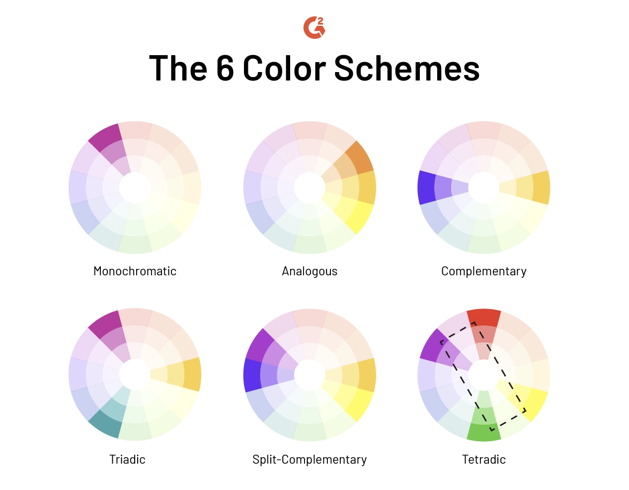
Теория цвета - важнейший инструмент для дизайна интерьера, помогающий создать баланс и гармонию.
Два наиболее важных понятия - цветовой круг и цветовые схемы.
Оба они помогают дизайнерам создавать палитры, которые улучшают настроение и визуальный поток в доме.
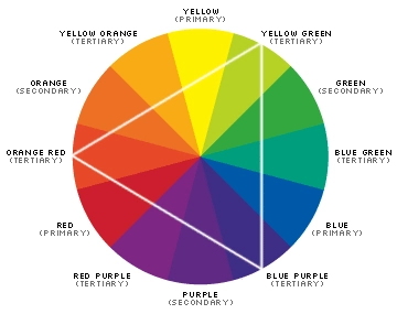
Цветовой круг - один из самых важных инструментов в дизайне интерьера.
Первоначально разработанный сэром Исааком Ньютоном в 1666 году, он организует первичные, вторичные и третичные оттенки в форме круга.
К основным цветам относятся красный, синий и желтый.
Вторичные оттенки - зеленый, оранжевый и фиолетовый - создаются путем смешивания первичных.
Третичные цвета возникают из смешения первичных и вторичных тонов, предлагая шесть дополнительных вариаций.
Изучая колесо, дизайнеры могут визуализировать взаимосвязи между цветами.
Например, теплые и холодные тона можно определить с первого взгляда, что облегчает создание контраста или баланса.
Колесо также иллюстрирует, как сочетания цветов влияют на восприятие и настроение.
Красный цвет часто передает энергию, синий - спокойствие, а зеленый - баланс.
В дизайне интерьера цветовой круг служит дорожной картой.
Он поможет подобрать оттенки, которые свяжут разные помещения, предотвратят визуальные столкновения и позволят достичь эстетической гармонии.
Этот простой, но мощный инструмент - отправная точка для любого дизайнера, создающего продуманную палитру.
Помимо цветовой гаммы, дизайн интерьера опирается на цветовые схемы для структурирования палитры.
Теория цвета определяет несколько основных подходов, каждый из которых служит уникальной цели в доме.
Еще одним ключевым принципом является Правило 60-30-10.
При этом палитра делится на 60% доминирующего цвета, 30% второстепенного оттенка и 10% акцента.
Это позволяет сохранить пропорции, но в то же время дает возможность для творчества.
При продуманном применении эти схемы помогают интерьерам обрести красоту и функциональность.
Они помогают дизайнерам создавать естественные пространства, оставляя при этом место для смелого самовыражения.
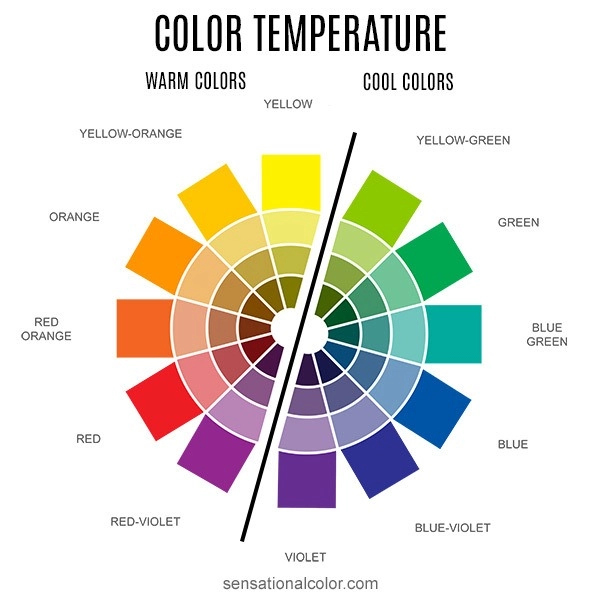
Цветовая температура - ключевой принцип Теория цвета в дизайне интерьера.
Он делит оттенки на холодные, теплые и нейтральные группы, каждая из которых несет в себе различные эмоциональные эффекты.
Прохладные оттенки, такие как голубой и зеленый, навевают спокойствие, поэтому они идеально подходят для спален, ванных комнат и помещений для отдыха.
Теплые оттенки, такие как красный, оранжевый и желтый, привносят энергию и живость, идеально подходящие для кухонь, столовых и общественных зон.
Нейтральные тона, такие как бежевый, серый и тауп, помогают сбалансировать перепады температур.
Они также служат гибким фоном, подчеркивающим смелые акценты.
Например, сочетание зеленого с розовым или серого с желтым создает динамичный контраст, который кажется современным и сбалансированным.
В дизайне интерьера понимание температуры позволяет создать ощущение, что каждое помещение соответствует своему назначению.
Прохладные оттенки способствуют отдыху, теплые цвета стимулируют активность, а нейтральные объединяют палитру.
Такое продуманное использование цветовой температуры создает интерьеры, которые одновременно визуально привлекательны и эмоционально комфортны.
Значение цвета в дизайне интерьера никогда не бывает абсолютным - оно зависит от контекста.
Теория цвета учит, что оттенки взаимодействуют как с физическим пространством, так и с психологическим настроем.
Акцентная стена глубокого красного цвета может заряжать энергией в столовой, но быть чрезмерной в небольшом офисе.
Мягкий бежевый может казаться элегантным при естественном освещении, но тусклым при искусственном.
Точно так же культурный контекст формирует восприятие: в одних местах белый цвет символизирует чистоту, в других - траур.
Физическое окружение также влияет на интерпретацию.
Цвета, расположенные рядом друг с другом, меняют свое значение: зеленый кажется более свежим рядом с розовым, а серый - более резким рядом с синим.
Соотношение фона, акцентов и освещения создает уникальные впечатления.
В дизайне интерьера контекст гарантирует, что цвета не будут выбираться изолированно.
Дизайнеры тестируют сочетания в реальных помещениях, наблюдая за тем, как свет и обстановка влияют на конечный вид.
Такой подход гарантирует, что палитры будут аутентичными, гармоничными и подходящими для каждой обстановки.
Теория цвета - важнейший инструмент в дизайне интерьера, позволяющий понять, как цвета формируют эмоции и впечатления.
Применяя эти принципы, дизайнеры создают пространства, которые ощущаются как целенаправленные, увлекательные и гармоничные.
Цвета влияют на настроение, восприятие и даже на воспринимаемый размер и энергетику помещения.
Различные цвета вызывают разные эмоциональные реакции в дизайне интерьера.
Красный цвет передает страсть, волнение, а иногда и гнев, поэтому он идеально подходит для обеденных зон и энергичных помещений.
Желтый цвет ассоциируется с радостью и оптимизмом, украшая кухни, игровые комнаты или творческие студии.
Синий цвет создает спокойствие и симпатию, идеально подходит для спален, офисов и зон отдыха.
Green fosters balance and tranquility, often used in living rooms or spaces that connect to nature.
By understanding these emotional associations through color theory, designers can intentionally influence how people feel in each room.
Pairing colors thoughtfully allows a home to feel cohesive while enhancing the intended atmosphere of each area.
Interior design uses color theory to regulate the mood of a space.
Cool colors like blue and green encourage relaxation and focus, making them suitable for bedrooms or study areas.
Warm colors, such as red and yellow, stimulate energy and activity, ideal for kitchens, gyms, or entertainment rooms.
Designers also consider balance when combining hues.
For example, a pop of red in a mostly blue room energizes without overwhelming, while soft yellow accents lift a neutral palette.
These subtle adjustments can create calm, vibrant, or uplifting atmospheres depending on the desired experience.
By consciously applying color theory, mood can be tailored to each space’s function and purpose.
This approach ensures interiors are not only visually appealing but also emotionally supportive for daily living.
Colors affect how we perceive the size, brightness, and flow of spaces in interior design.
Glossy surfaces reflect more light, making a room appear larger and more dynamic.
Matte textures soften colors, creating intimate or cozy environments.
Neutral tones enhance other colors, allowing accents to stand out without clashing.
Maintaining color harmony across rooms ensures a smooth spatial flow from one area to another.
For example, repeating accent shades in hallways, living areas, and bedrooms connects spaces visually.
Properly applied color theory makes interiors feel expansive, balanced, and comfortable.
It guides designers in creating cohesive homes that are both aesthetically pleasing and functionally effective.
Color mixing is an essential concept in color theory and plays a vital role in interior design.
By adjusting hues with white, black, or gray, designers can create endless variations that shape atmosphere and mood.
Understanding hue, tint, shade, and tone gives homeowners the tools to achieve balance and style in any room.
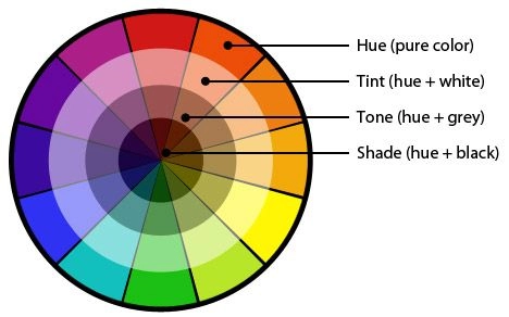
A hue is a pure color on the color wheel, such as red, blue, or yellow.
In interior design, hues form the foundation of every palette, setting the overall direction of a space.
Red may be used to energize a dining room, while blue builds calmness in a bedroom.
These basic colors carry strong emotional associations and serve as building blocks for all further adjustments.
Color theory shows how hues interact with one another, creating harmony or contrast.
Designers often start with a dominant hue and then adapt it into tints, shades, or tones to provide depth.
By understanding hues, interiors achieve clarity and consistency in design.
A tint is created by adding white to a hue, producing a lighter and softer version of the color.
In interior design, tints are widely used to brighten spaces and create airy, fresh environments.
For example, pale blue walls give a coastal, relaxing feel, while pastel pink brings charm and softness to a nursery.
Tints are effective in small rooms because they reflect light and make the space appear larger.
They also serve as versatile backdrops, allowing bolder furniture and accents to stand out.
According to color theory, tints provide balance when paired with deeper tones, ensuring the palette does not feel overwhelming.
By incorporating tints, designers can create gentle, welcoming interiors that feel both stylish and comfortable.
A shade is formed when black is added to a hue, resulting in a darker and more intense version of the color.
In interior design, shades bring depth, drama, and sophistication to a space.
Dark green walls can create a moody library, while navy blue makes a living room feel elegant and grounded.
Shades are particularly useful in large rooms, where darker tones add intimacy and focus.
They also highlight textures, such as wood or stone, by providing strong visual contrast.
Color theory emphasizes that shades must be balanced with lighter elements, such as neutral walls or reflective surfaces, to prevent heaviness.
Used wisely, shades give interiors character and a sense of luxury, making them perfect for statement designs.
A tone is created when gray, a mix of black and white, is added to a hue.
Tones soften colors without making them overly light or dark, giving them a more subtle and sophisticated quality.
In interior design, tones are valuable for creating balanced, livable spaces that feel timeless.
Muted blues or greens work well in living rooms, offering calm without appearing too bold.
Earthy tones, such as terracotta or olive, bring warmth and elegance while maintaining versatility.
According to color theory, tones are especially useful for transitional spaces like hallways, where they connect bold and neutral rooms seamlessly.
By applying tones, designers achieve harmony across the home, ensuring that interiors feel curated rather than chaotic.
The square color scheme is an advanced principle of color theory that adds vibrancy and balance to interior design.
It uses four evenly spaced hues on the color wheel, creating a bold mix of warm and cool tones.
When applied thoughtfully, this scheme provides variety without losing harmony.
A square color scheme draws from primary, secondary, and tertiary hues.
For example, a palette might include red, yellow-green, blue, and violet.
Because the colors are evenly spaced, the result feels dynamic but still balanced.
Color theory shows that this combination avoids monotony while maintaining visual order.
Each hue contrasts with the others, yet the spacing ensures harmony.
This makes it particularly suitable for homeowners who want interiors that feel playful yet sophisticated.
In interior design, this scheme is ideal for spaces that need personality, such as creative studios, living rooms, or social areas.
It allows for experimentation while ensuring that the overall palette does not become chaotic.
One of the strengths of the square color scheme is its mix of warm and cool hues.
This contrast adds depth, dimension, and visual flow to interiors.
Warm colors such as red or orange inject energy, while cool colors like blue or green provide calmness.
Interior design relies on balance, so not all colors should be used in equal measure.
The 60-30-10 rule helps organize the palette:
Color theory emphasizes that harmony is achieved when warm and cool tones complement each other rather than compete.
For example, a warm terracotta sofa may sit beautifully against cool teal walls, tied together with neutral flooring.
In practice, the square scheme allows designers to craft unique, expressive interiors.
A living room may use navy blue as the base, mustard yellow for furniture, forest green in textiles, and violet accents in artwork.
This combination creates vibrancy while still feeling intentional.
Kitchens and dining areas also benefit from this scheme, where bold colors stimulate conversation and creativity.
Meanwhile, neutrals such as grey, beige, or white can be added to soften transitions between hues.
Color theory teaches that distribution matters more than the individual shades.
By thoughtfully assigning roles to each hue, interior design projects become both cohesive and exciting.
The square scheme proves that boldness and harmony can coexist beautifully in home décor.
In interior design, emphasis is essential for creating focal points that guide the eye.
Color theory plays a vital role in shaping attention and highlighting key areas within a space.
By using contrasting hues, accent shades, and strategic placement, designers can control how a room feels and flows.
Contrasting colors are one of the most effective tools in interior design.
When applied with knowledge of color theory, strong contrasts create energy and focus.
For example, pairing deep navy walls with bright orange cushions ensures the eye is immediately drawn to the seating area.
High contrast is often used in modern living rooms, art galleries, and office spaces.
It emphasizes certain areas without overwhelming the overall palette.
The goal is to create balance so the focal point feels intentional, not distracting.
Designers often use contrast to highlight artwork, statement furniture, or architectural details.
This makes spaces more engaging while still maintaining a sense of unity.
Accent colors are another way interior design establishes emphasis.
Color theory suggests that small doses of vibrant hues add excitement without overpowering the main scheme.
For example, a neutral grey living room becomes lively with emerald cushions, golden lighting, or a bold rug.
Accents are flexible and can be changed seasonally or with trends.
They allow homeowners to experiment with different tones while keeping the main palette timeless.
This method is especially effective in bedrooms, foyers, and lounges, where personality is showcased.
When choosing accent colors, designers often pick shades that complement the dominant palette while still standing out.
The right accents elevate interiors, making them both stylish and memorable.
Color blocking is a modern approach in interior design that creates emphasis through large, solid sections of color.
Color theory explains that placing two or more contrasting blocks side by side produces strong visual rhythm.
For instance, painting one wall terracotta, another teal, and balancing with neutral flooring instantly defines zones.
This method works well in open-plan spaces where each area needs its own character.
It can separate a dining area from a lounge without physical partitions.
Color blocking also works with furniture, rugs, or even ceiling details.
When executed thoughtfully, color blocking ensures interiors feel creative and dynamic.
It transforms plain rooms into bold design statements while maintaining harmony.
Gradients, also called ombre effects, bring a softer approach to emphasis in interior design.
Color theory shows that gradual transitions between shades add depth and visual flow.
For example, a wall that fades from pale pink at the base to deep rose at the top creates a sense of movement.
This method is ideal for bedrooms, bathrooms, or feature walls where subtle drama is desired.
It avoids the harshness of high contrast while still directing attention.
Designers often apply ombre effects to textiles like curtains, rugs, or bed linen to echo the theme.
Gradients offer a sense of calm, making interiors appear layered and refined.
They highlight focal points without overwhelming the space.
Complementary color schemes are central to both color theory and interior design.
By pairing hues from opposite sides of the color wheel, such as blue and orange or red and green, designers create instant emphasis.
This approach is effective for highlighting architectural features, furniture, or artwork.
For example, a sage-green wall can make a crimson armchair pop dramatically.
The contrast is bold yet naturally harmonious because of the color wheel relationship.
Complementary schemes work best when one shade is dominant and the other is used sparingly as an accent.
This ensures that interiors feel balanced rather than overwhelming.
In monochromatic interiors, isolated colors can create striking focal points.
Color theory suggests that a single vibrant hue against a neutral backdrop immediately attracts attention.
For example, a minimalist white living room with a single cobalt-blue sofa becomes visually powerful.
This method is often used in luxury interiors where simplicity is key.
It allows one object or feature to become the centerpiece without visual clutter.
Designers may use isolated colors in art, furniture, or lighting fixtures to create a strong statement.
Isolated hues ensure interiors remain clean and elegant while still delivering emphasis.
Color can also be used to emphasize architectural elements in interior design.
Through color theory, designers know that specific shades can bring depth and drama to arches, ceilings, moldings, or alcoves.
For example, painting ceiling beams a darker shade than the walls draws attention upward.
Highlighting door frames or window trims in bold tones makes them stand out as design features.
Even staircases can become a focal point with carefully chosen hues.
This technique enhances the structure of a home while adding artistic flair.
It demonstrates how color is not just surface decoration but a tool for shaping perception and experience.
Choosing the right shades is one of the most important decisions in interior design. By applying principles from color theory, you can create balanced, elegant, and visually engaging spaces. The following tips will help you select colors with confidence and precision.
In interior design, the color wheel is the foundation of all color choices. Understanding the basics of color theory allows you to see how hues interact and which combinations create harmony.
Using the color wheel ensures your palette is not random but intentional, making spaces feel cohesive and professionally designed.
A single hue can take on endless variations when adjusted with tints (adding white) or shades (adding black). In interior design, this technique from color theory prevents spaces from feeling flat.
By layering tints and shades, you give walls, furniture, and textiles dimension, ensuring a room feels rich and visually engaging.
Every color evokes a psychological response, making intentional choices essential in interior design. Color theory reveals how different hues influence mood.
Selecting colors for their emotional effect ensures that your interiors not only look beautiful but also feel comfortable and purposeful.
A monochromatic palette may sound limiting, but in interior design it offers sophistication and balance. Color theory shows that variations of one hue—tints, shades, and tones—can create depth and consistency.
When enhanced with textures and patterns, monochromatic schemes avoid monotony while keeping interiors visually polished.
Too much of a primary hue can overwhelm a room, so balance is key in interior design. According to color theory, secondary colors derived from mixing primaries help soften bold tones.
By blending primary and secondary hues strategically, you create interiors that are vibrant without becoming visually chaotic.
Even the best color choices can backfire if proportions aren’t considered. Interior design relies on the 60-30-10 rule, a classic guideline from color theory.
This proportional approach ensures no single hue dominates the room, keeping the design elegant and well-balanced.
Lighting plays a critical role in interior design because it alters how colors appear. Color theory explains that hues shift under natural and artificial light.
Testing paint samples in both daylight and evening light helps ensure the chosen palette works at all times.
Bold color schemes need grounding, and neutrals provide that balance in interior design. Color theory suggests pairing bright tones with muted shades to create contrast without chaos.
Neutrals act as stabilizers, allowing statement colors to shine without overwhelming the room.
The 60-30-10 rule is one of the most reliable tools in interior design. Rooted in color theory, it simplifies complex palettes into a harmonious arrangement.
By following this ratio, you achieve a balanced, designer-approved look that feels both stylish and cohesive.
Understanding color theory is essential in interior design.
It helps you create harmony, balance, and emotion in every space.
When you know how colors interact, you can design interiors that feel natural and engaging.
The first step is to understand how to choose a color family.
In interior design, your color family sets the overall mood of the space.
Color theory divides shades into two main categories: warm and cool tones.
Each family carries its own energy, personality, and emotional effect.
Warm tones include shades of red, orange, and yellow.
These colors radiate energy, brightness, and movement.
They are perfect for social areas such as living rooms and dining spaces.
Warm tones make a room feel lively, welcoming, and full of character.
Cool tones include shades of blue, green, and violet.
These colors bring calm, relaxation, and serenity.
They are ideal for bedrooms, bathrooms, or workspaces that need focus and peace.
Cool tones expand a room visually and give interiors a sense of openness.
For best results in interior design, stay consistent with your chosen family.
A room feels more harmonious when all main shades share the same temperature.
Mixing too many warm and cool tones can make a space feel chaotic.
Instead, allow one family to dominate and use accents carefully.
Key points for choosing a color family:
By applying this color theory principle, you create a room that feels intentional.
Your interiors will appear polished, professional, and emotionally aligned with their function.
In interior design, balance is everything.
Color theory teaches that the three-color approach works best for most spaces.
By following the 60-30-10 rule, you can create a room that feels both structured and visually appealing.
The 60-30-10 design rule explained:
This formula ensures your interior design looks cohesive instead of overwhelming.
The largest color grounds the room, the secondary adds interest, and the accent injects personality.
When working with three colors, neutrals are essential.
Color theory shows that shades like white, beige, gray, or taupe act as unifiers.
They allow bolder colors to shine without clashing.
For example, pairing navy blue with mustard yellow becomes more elegant when softened by a gray sofa or white trim.
Neutrals also create visual breathing space.
They prevent the interior design from looking too busy or cluttered.
Using variations of the same three colors adds depth and texture.
Instead of three flat hues, explore light, medium, and dark tones.
This creates subtle layers and avoids monotony.
Например:
This approach applies color theory in a flexible way.
It allows creativity while keeping the interior design polished and harmonious.
By applying the 60-30-10 rule with smart variations, you can achieve balance, interest, and timeless elegance in any room.
In interior design, the relationship between walls and ceilings defines the atmosphere of a room.
Color theory suggests that thoughtful contrasts or harmonies between these two surfaces can enhance both height and brightness.
By adjusting tones, you can create a space that feels either expansive and airy or bold and dramatic.
A simple way to elevate interior design is by painting ceilings slightly lighter than the walls.
Color theory supports this trick, as lighter shades reflect more light, making the ceiling appear higher.
The rule of thumb is to choose a ceiling color about 20% lighter than the wall color.
Например:
This subtle adjustment creates visual openness and ensures rooms feel less confined.
For homeowners who prefer bold statements, high-contrast finishes can transform interior design.
Color theory highlights that glossy or lacquered ceilings in darker shades add depth and luxury.
Pairing a navy ceiling with crisp white walls creates striking contrast, while a black lacquered ceiling with neutral walls evokes modern sophistication.
This technique works especially well in dining rooms, libraries, or entertainment spaces where drama is welcome.
While contrast adds energy, harmony is equally powerful.
Using tones from the same color family ensures continuity.
For instance, pairing sage green walls with a lighter mint ceiling maintains unity while still adding dimension.
By carefully balancing contrast and harmony, interior design can achieve both elegance and comfort.
Through strategic use of color theory, walls and ceilings become design partners rather than afterthoughts.
In interior design, rugs and flooring serve as powerful tools to connect different spaces.
According to color theory, these elements can unify contrasting palettes while adding comfort and personality.
Even if wall colors differ, rugs and floors can establish continuity across rooms.
Rugs act as bridges in interior design, linking one room’s palette with another.
Color theory shows that they don’t need to match wall colors exactly—slight variations in hue are enough to maintain flow.
Practical tips include:
This method allows variety while preventing visual disconnection.
Flooring plays a central role in interior design because it spans multiple rooms.
Color theory emphasizes using consistent materials, like hardwood or marble, to unify spaces.
Even when walls change color, the floor provides stability and coherence.
Например:
This approach ensures a natural flow without demanding identical wall treatments.
Interior design thrives on balance between unity and variety.
Color theory suggests that slight tonal differences keep spaces interesting while still harmonious.
Choosing rugs or flooring with shades that are lighter, darker, or textured variations of wall colors achieves this effect.
Instead of forcing exact matches, aim for complementing undertones.
This creates warmth and sophistication while linking one room seamlessly to the next.
In interior design, trim is often overlooked, yet it has a powerful role in shaping how rooms connect.
Color theory highlights that consistent trim colors create harmony, while thoughtful contrasts add character.
From doors and baseboards to window casings, trim serves as a visual frame that reinforces cohesion across spaces.
Consistency is key in interior design, and trim provides an anchor that ties together different wall colors.
According to color theory, repeating the same trim shade in every room prevents spaces from feeling disjointed.
Примеры включают:
This approach makes transitions smooth, even when wall palettes vary.
Interior design relies heavily on neutral elements, and trim is no exception.
Color theory suggests that white or light neutral trims act as stabilizers, ensuring harmony across bold or muted walls.
Advantages of neutral trim include:
Neutral trims serve as a timeless option that suits both traditional and modern interiors.
In interior design, the trim should support, not compete with, wall colors.
Color theory emphasizes choosing trim after finalizing the primary palette, ensuring balance and proportion.
Practical steps include:
This sequence guarantees that the trim enhances rather than disrupts the overall scheme.
In interior design, lighting is one of the most influential factors in how colors appear.
Теория цвета показывает, что один и тот же оттенок может выглядеть совершенно по-разному под разными источниками света.
Понимание этих эффектов необходимо для создания целостного и визуально привлекательного пространства.
Различные типы освещения изменяют восприятие цвета в дизайне интерьера.
Тестирование цветов при различных условиях освещения гарантирует, что ваша палитра будет работать в любой ситуации.
Такой подход применяет теорию цвета на практике, помогая сохранить гармонию и избежать нежелательных сюрпризов.
Естественное освещение меняется в течение дня, что влияет на дизайн интерьера.
Теория цвета учит, что наблюдение за комнатами в разное время позволяет сохранить постоянство выбранных оттенков.
Даже едва заметные изменения в солнечном свете могут изменить восприятие цветов и общее настроение.
Тени и тусклые углы могут нарушить визуальную гармонию в дизайне интерьера.
Применение теплых тонов в соответствии с теорией цвета помогает смягчить эти зоны, создавая ощущение гостеприимства и равновесия.
Экспериментируя с освещением, вы гарантируете, что ваш дизайн интерьера останется ярким, гармоничным и эмоционально привлекательным в течение всего дня.
В дизайне интерьера размер помещения сильно влияет на восприятие цветов.
Теория цвета помогает дизайнерам выбирать тона, которые расширяют пространство и создают желаемую атмосферу.
Правильно подобранные оттенки помогут маленьким комнатам казаться просторнее, а большим - уютнее и привлекательнее.
В маленьких комнатах лучше использовать светлые, воздушные цвета, чтобы максимально увеличить ощущение пространства.
Теория цвета объясняет, что светлые оттенки отражают больше света, из-за чего стены и потолки кажутся более удаленными друг от друга.
Советы для маленьких помещений включают в себя:
Благодаря такому подходу маленькие комнаты будут выглядеть свежо, уютно и пропорционально.
Даже едва заметные изменения в оттенках и тонах могут заметно повлиять на пространственное восприятие.
Большие комнаты иногда кажутся пустыми и безликими.
Использование темных тонов в соответствии с теорией цвета добавляет теплоту, интимность и глубину.
Техника для больших пространств включает в себя:
By selecting appropriate hues, interior design transforms oversized spaces into inviting, comfortable areas.
Whether the room is small or large, color theory ensures visual balance.
Considering room size in your interior design plan allows each space to feel purposeful, harmonious, and visually appealing.
Mastering the fundamentals of interior design ensures that every room is functional, comfortable, and visually appealing.
Color theory is an essential companion to these basics, as color choices enhance balance, harmony, and the perception of space.
The first foundational principle is understanding balance and space in any room.
Balance and space are critical in interior design.
Color theory helps guide the perception of proportion and scale while arranging furniture and decor.
Proper balance ensures a room feels harmonious rather than chaotic or empty.
Before decorating, analyze the room’s dimensions and architectural features.
Doors, windows, and structural elements affect how furniture is placed.
Using color theory, light tones in small spaces expand the perceived size, while darker hues in large rooms create intimacy.
This interplay of color and layout strengthens the overall balance.
Interior design achieves visual harmony through different types of balance.
By applying these principles, interior design creates spaces that feel intentional and pleasing.
Color theory enhances this process by guiding hues and contrasts that support visual equilibrium.
Unity is a core principle in interior design that ensures every element feels connected and cohesive.
Color theory helps achieve unity by harmonizing hues, tones, and contrasts throughout a space.
A well-unified room feels balanced, comfortable, and visually appealing.
Using consistent materials reinforces cohesion across rooms.
Consistency in materials enhances both visual flow and functional comfort.
Color theory guides the choice of complementary or analogous tones to maintain subtle cohesion.
Interior design achieves unity by keeping furniture proportional.
A cohesive approach ensures that rooms feel like part of a larger, intentional design story.
Rhythm in interior design creates movement and flow within a space.
Color theory supports rhythm by repeating hues, shades, or complementary colors to guide the eye.
A room with rhythm feels dynamic but still harmonious.
Repeating decorative elements reinforces continuity and visual interest.
By thoughtfully applying repetition, rooms feel connected and intentional rather than random.
Color theory encourages subtle variations of repeated colors to avoid monotony.
This principle ensures that interior design is both visually engaging and functionally coherent, providing a seamless transition from room to room.
Proportion is a fundamental aspect of interior design that ensures each element feels balanced within a space.
Color theory complements proportion by guiding how hues and tones interact with furniture and decor, enhancing visual harmony.
Proper proportions make rooms feel intentional, functional, and aesthetically pleasing.
Lines help define structure and direction in interior design.
Using lines thoughtfully allows rooms to feel proportional and guides the eye naturally.
Color theory can enhance this effect, for example, using contrasting or complementary hues along lines to highlight architectural features.
Matching furniture scale to room dimensions is crucial.
Color theory assists in emphasizing proportionality by using tones and shades to balance dominant pieces with surrounding decor.
Well-scaled spaces feel comfortable, functional, and visually appealing.
Contrast adds intrigue and prevents interior design from feeling flat or monotonous.
Color theory is essential for creating contrast through complementary colors, light vs. dark tones, or vibrant accents.
A well-placed contrast elevates a room’s character and directs attention.
Using contrast strategically enhances interior design without overwhelming the space.
The key is moderation—one or two contrasting elements are enough to energize the space.
Color theory helps balance contrast by guiding complementary or analogous hues.
By combining proportion and contrast thoughtfully, interior design achieves rooms that feel dynamic, balanced, and visually engaging.
Emphasis is essential in interior design for creating focal points that anchor a room and guide attention.
Color theory enhances emphasis by using contrasting or complementary hues to make key elements stand out.
A well-chosen focal point adds character and balance to any space.
Identify the element you want to highlight in a room.
Use supporting decor to reinforce emphasis:
Color theory ensures that supporting colors enhance, rather than compete with, the focal element.
Small details support the focal point without overwhelming the room.
When emphasis is applied thoughtfully, interior design feels intentional, harmonious, and visually engaging.
Details transform a room from ordinary to extraordinary in interior design.
Color theory guides how these touches interact with the overall palette, creating cohesion and subtle visual interest.
Even minor elements can elevate the perceived quality and personality of a space.
Meticulously chosen details add character and refinement.
These small items should complement the main color palette and support the overall design concept.
By paying attention to details, interior design achieves spaces that feel curated, personalized, and visually satisfying.
Cultural and personal factors play a pivotal role in interior design.
Color theory is not universal; hues carry different meanings across cultures and evoke unique emotional responses.
Designers must balance symbolism, client preferences, and functional aesthetics for a harmonious result.
Colors hold different meanings depending on cultural context, which impacts interior design choices.
Using color theory, designers select shades and combinations that honor cultural symbolism while maintaining visual harmony.
Considerations include wall colors, furniture, fabrics, and accents to create spaces that resonate culturally and emotionally.
Client preferences are equally important in interior design.
Color theory helps translate these personal choices into cohesive designs.
For example, a client who loves blue may incorporate it as a primary wall color while balancing warmth through accent tones.
Successful interior design harmonizes cultural meaning with individual style.
Using color theory, designers create interiors that feel authentic, functional, and visually satisfying.
The result is a home or workspace that aligns with both cultural context and personal identity.
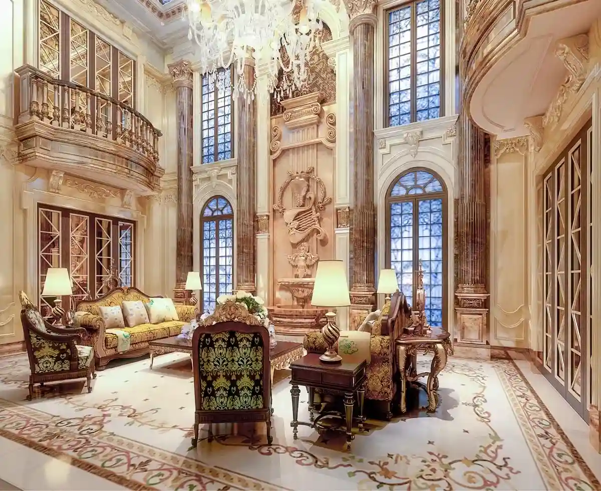
Мраморная инкрустация Stone Master offers unique opportunities to elevate interior design through carefully curated color palettes.
Walls and floors set the foundation for harmony, while bespoke marble inlay pieces provide accents and focal points.
Applying color theory ensures that each element contributes to a cohesive, visually stunning environment.
Walls and floors are the largest surfaces in a space and dictate the overall mood in interior design.
Using color theory, designers can balance contrasts, harmonize warm and cool tones, and guide the eye naturally through the space.
The combination of walls, floors, and accent elements sets a strong foundation for a cohesive color palette.
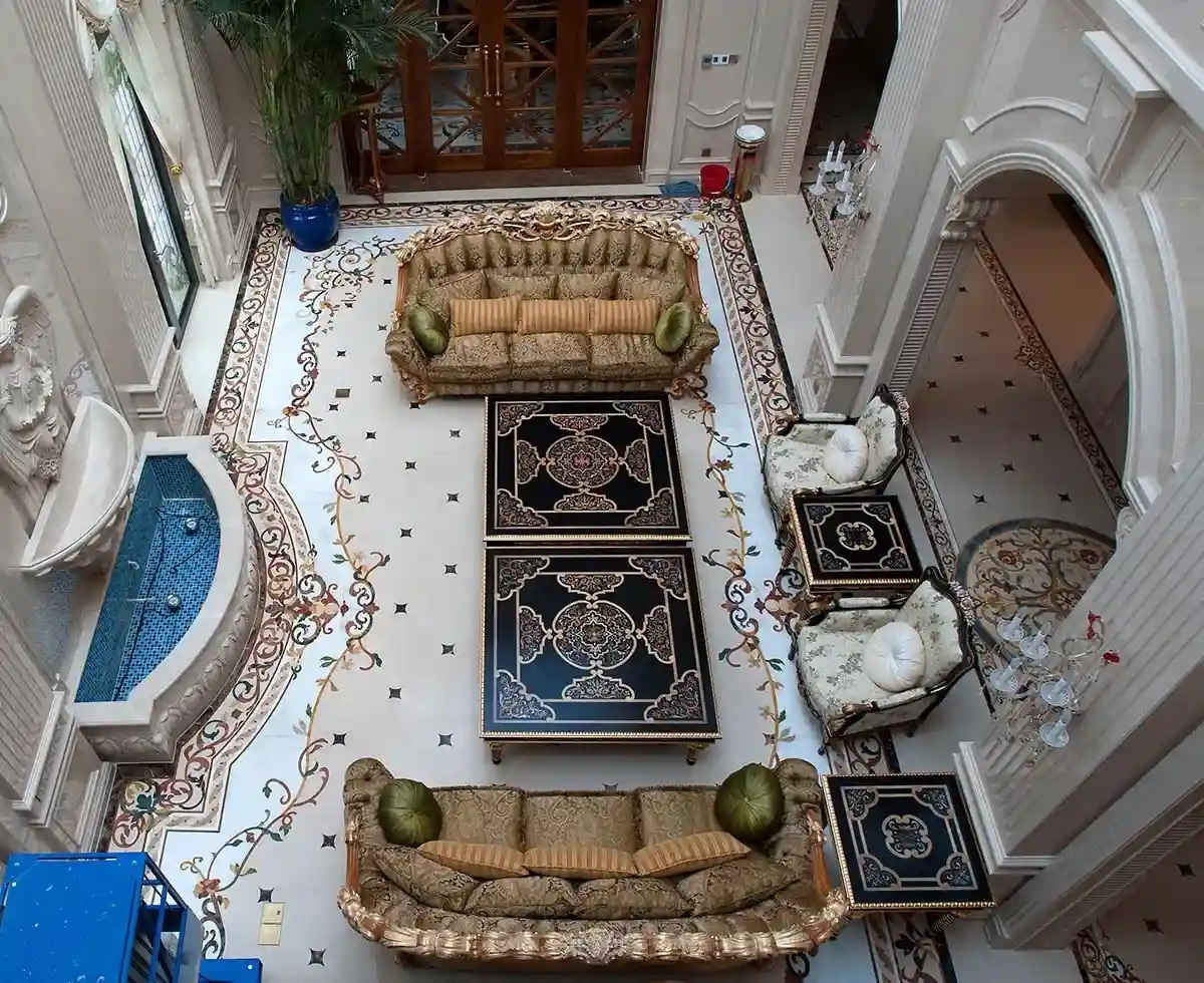
Stone Master offers handcrafted marble inlay solutions for various interior applications.
Each piece can be customized to match or contrast with room colors, helping designers apply color theory effectively.
This approach allows homeowners to express personal style while maintaining visual balance.
Настройка is key to achieving harmony in interior design.
With Stone Master Marble Inlay, spaces gain character, luxury, and cohesion.
A thoughtful combination of colors, patterns, and textures ensures interiors feel curated, elegant, and timeless.